ARITZIA
Sr. Digital Product Designer / 2018 — Present / Live Site
Purpose — To design a world class omni-channel customer experience by balancing functionality, usability, and aesthetics, raising the bar for quality, striving for ultimate simplicity and beauty, providing a fashion-forward and culturally-relevant perspective, and understanding the science behind status and culture.
My Role — I was among the first to join the design team in 2018, responsible for creating an aspirational ecommerce experience and setting the design direction for Aritzia.com and iOS app.
As a Senior Digital Product Designer, my responsibilities include maintaining and designing new mobile app features, evolving our design system, shaping how our design teams think and work, supporting other areas of the business through collaboration, and mentoring other designers. I regularly collaborate with a variety of cross-functional partners, including Digital Product Management, Technology, Data & Analytics, Marketing, Creative, Merchandising, and Legal to design Everyday Luxury™ experiences with every interaction and consistently deliver customer and company value.
Results — Since starting, we’ve consistently improved conversion rates to keep up with rapid session growth. This contributed to annual ecommerce revenue growth between 30-88%, reaching $1.29 Billion in Fiscal 2026. The Aritzia iOS app reached #1 in the App Store across North America and Aritzia.com was ranked as the #1 Women’s Fashion (multi-brand) site in Newsweek's Best Online Shops 2023.
Below are select initiatives I have led or significantly contributed to:
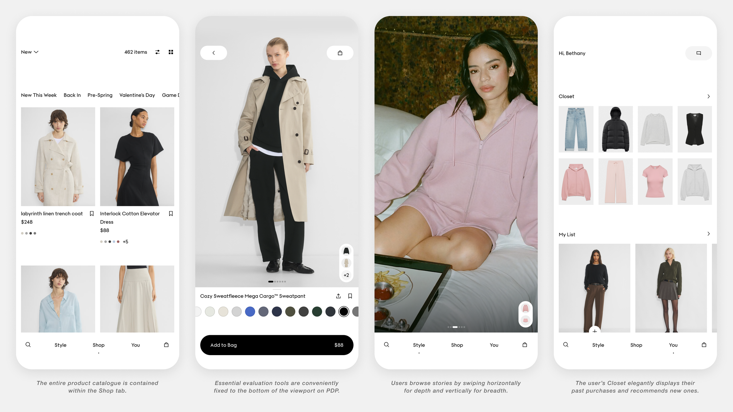
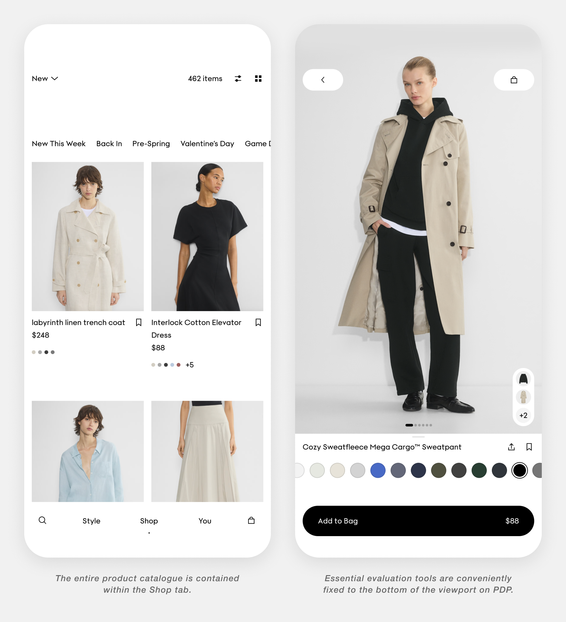
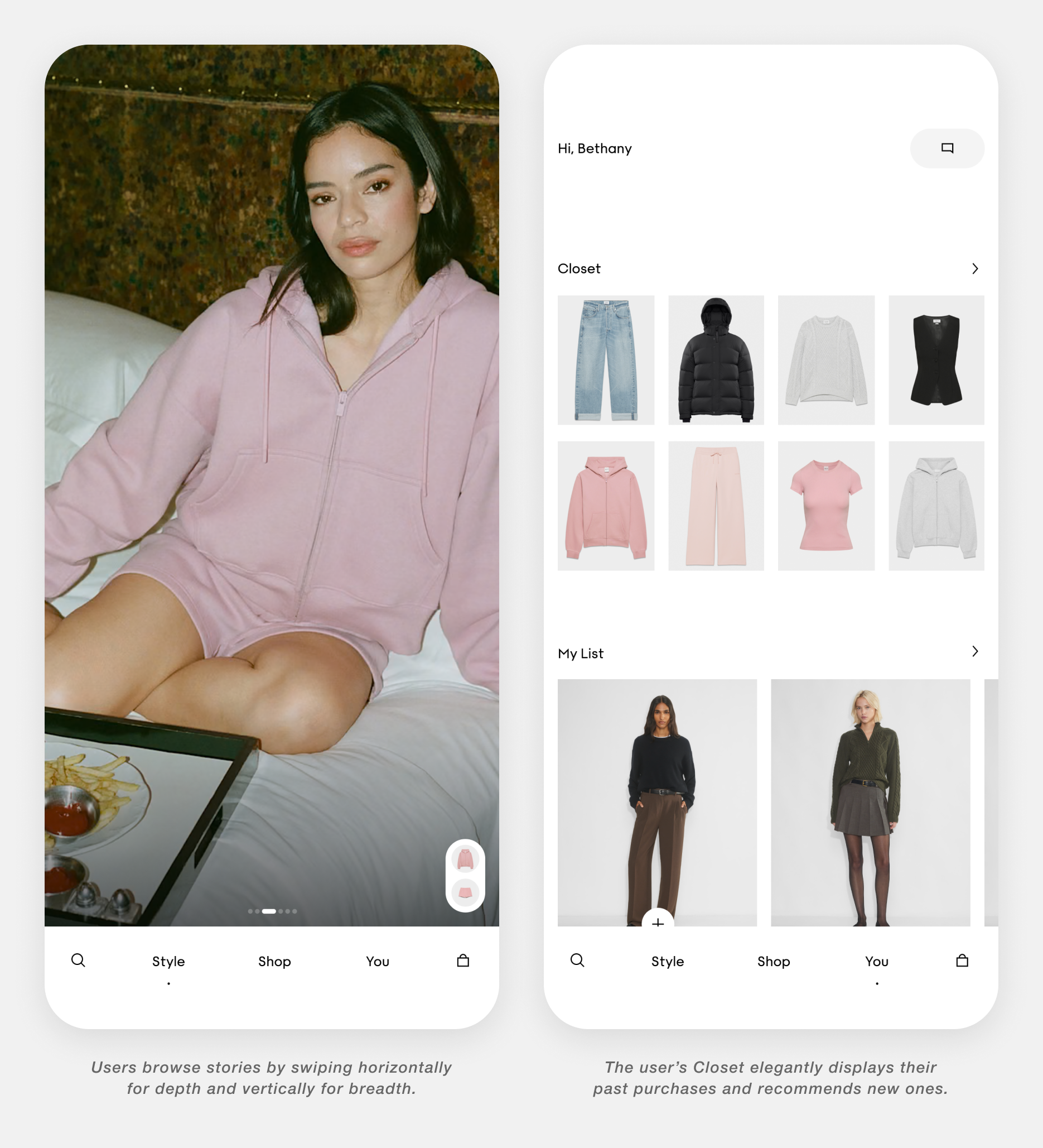
iOS App
In 2025, I supported the design and development of the Aritzia iOS app in partnership with best-in-class agency, Work & Co. The main responsibilities for the Aritzia design team included:
Outlining the differentiators and core value props of the app compared to web.
Exploratory design work to define the aesthetic and core functionality of the app.
Participating in design reviews and providing direction on the look and feel of the interface.
Synthesizing user research feedback and iterating on the design.
Creating detailed requirement documentation for features and functionality.
Delivering detailed implementation feedback to the developers.
The final product features most of the same core shopping functionality as the website, with the addition of a dedicated Style section featuring shoppable campaigns and stories, app-exclusive early access, a Closet to showcase users’ past purchases and provide outfit ideas, PDP 2.0, and an iOS-native version of our Capsule design system.
The Aritzia iOS app launched in October 2025, reaching #1 in the App Store in North America across all categories and was recognized with three different Webby Honoree distinctions for the following categories:
Best Practices
Best User Interface
Shopping & Retail


Notify Me When Back In Stock
Based on data analysis and user research findings, we discovered several facts that helped us better understand customer behaviour surrounding out-of-stock items in 2023. High-level summary:
A high percentage of users saved an out-of-stock item to their List.
Restocked items have a high conversion rate relative to other items.
Most out-of-stock products will be restocked at some point.
Customers who use the List have a high intent to purchase.
With this in mind, we hypothesized that stock notifications would offer users an additional next step when encountering out-of-stock items that would capitalize on a highly converting user group to re-capture sales and welcome customers back to the site. A few principles outlined at the beginning of the project helped guide this work:
Customers should always be able to Special Order products when available.
Customers should maintain the ability to select a size to perform other actions or access other information related to their selection.
Customers should not require an account to receive stock notifications.
Customers should be made aware if a product won’t be available to purchase again.
Continue to prioritize product alternatives to encourage time-sensitive customers to explore our site.
Be sensitive to customer attention, inbox fatigue, and communication quality.
While driving sales, the experience also functions as a service moment. It helps customers understand availability, set expectations, and receive timely communication. The rest of the project saw me deliver a high-fidelity prototype for user testing, a breakdown of functionality to inform our roadmap, detailed interface specifications and criteria for each element, email strategy and design guidance for the Marketing team, and detailed implementation feedback for our developers.


Re-Evaluating Evaluation
The Bag and List are the user’s primary tools to organize current and future purchases on Aritzia.com. In 2019, these areas of the site were largely neglected and falling behind in regards to users’ expectations. I initiated and led a Discovery project to modernize them, develop a perspective on how they should be used, better understand what our customers need, and improve their usability, functionality, and aesthetic. This work quickly became about defining how customers evaluate, save, compare, and return to products across a cyclical journey. A summary of the steps I took:
Gathered all known facts regarding the Bag and List, including but not limited to: best practices, previous AB tests, user research studies, surveys, analytics data, customer feedback collected through our Concierge platform, word of mouth, and personal observations.
Documented questions and unknowns regarding the Bag and List.
Launched studies for any unanswered questions, briefing in Analytics and User Research teams.
Conducted a competitive analysis and grading of 10 competitors and aspirational examples, using Aritzia.com as a benchmark.
Articulated and prioritized problem themes based on impact.
Generated a list of guiding principles to set the foundation for future work.
Facilitated workshops with the design team and various stakeholders to brainstorm potential solutions.
Designed multiple functional blue-sky prototypes for user testing.
Iterated on design concepts, incorporating customer feedback.
Defined the core KPIs to measure the success of our work.
Created a roadmap of sequenced features and AB tests to move us towards our blue-sky design concepts.
By the end of the project, we had developed several features to help users curate and store their ideas, evaluate their next purchase, and seamlessly organize their favourite pieces. Additionally, we renamed and repositioned the List as a moodboard tool, catering to the beauty of our product photography and inspiration of our customers, by reducing non-essential and distracting information. This project resulted in significant increases to Add to Bag, View Bag, and Begin Checkout rates as well as a formalized process for Discovery that other designers adopted.


List 2.0
Furthering the hypothesis that the Bag & List are spaces to evaluate products and that the user’s journey is cyclical in nature, I led a design exercise in 2022 to visualize different ways of improving the organizational power of these spaces. The major problems I aimed to address were:
The sign-in requirement is the largest barrier for users looking to use the List. Most users navigate away from the page when prompted to sign in.
Once in the List, users do not have a way of quickly locating an item in a long list of products. They lack the refinement tools found on the PLP.
Users who rely heavily on the List do not have a way of organizing different intents, making desirable items fall down the List and often times, forgotten.
Removing the sign-in barrier is intended to reduce friction, while incentivizing users to create an account with a clear value prop: saving your items permanently. Upon authentication, these items are merged in with any existing ones. Additionally, the user gains the ability to create folders for their items which are able to be independently named and shared. Within each folder, users will find the same refinement tools as on the PLP: sorting by date added or price, and filtering by availability, colour, brand, and category, to help them effortlessly find and manage their items.
I designed and iterated on several concepts including the one shown above, to serve as a blue-sky concept to inform future enhancements. Developing this material allowed our teams to better understand the potential value and effort of developing this space.


Systematizing our Design Language
Between 2020—2021, we migrated from Sketch to Figma as our rapidly growing design team had largely switched to remote work. This meant we had to rebuild our design system from scratch while optimizing it for ease-of-use and scalability. I was instrumental in proactively building out a significant number of templates, components, and elements for our team to use, allowing them to design more efficiently and consistently. I became an expert in auto-layout, components, variants, and layer styles to educate our team, contribute to the system regularly, accelerate ongoing design work, and support the onboarding of a dedicated Design System squad.
I’ve become a key-player in the management of the system, actively sought out by others for Figma support as a subject matter expert, and a key-stakeholder for planning the future of the system.