Genuine Health Redesign
UI Design for iamota / 2017 / Live Site
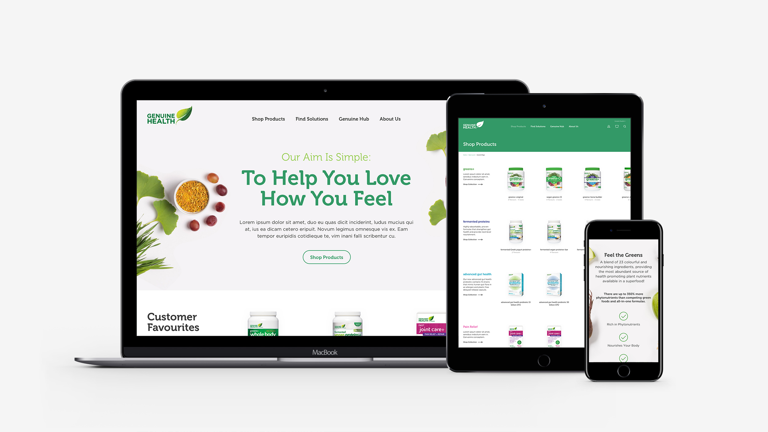
Purpose — To develop a needs-based "solutions centre" where users can find products to help with a specific health concern, offer advice and educate users on health and wellness, and overhaul their visual identity by creating a delightful new ecommerce experience for both Canada and USA.
My Role — Worked directly with our UX Designer to wireframe the main pages and components. I led and participated in workshops with our UX Designer, Strategy lead, and clients to develop the overall creative concept. I then designed all pages and components encapsulating the new visual language.

Wireframes (Product Exploration) — Some challenges we faced when developing wireframes include: intelligently displaying products within collections without overwhelming the user, allowing users to shop by "health concern" if they were unfamiliar with the product lineup, and creating a component-based system for collection pages with varying amounts of content.

Main Navigation (Mobile) — With the desire to make Genuine Health's products understandable and accessible for everyone, we developed an incredibly simple navigation that allows users to take multiple paths to find the product that is right for them.
We utilized separate content panels in the navigation to keep it from being cluttered. Sliding animations (not shown) were incorporated to bring focus to the next set of options.

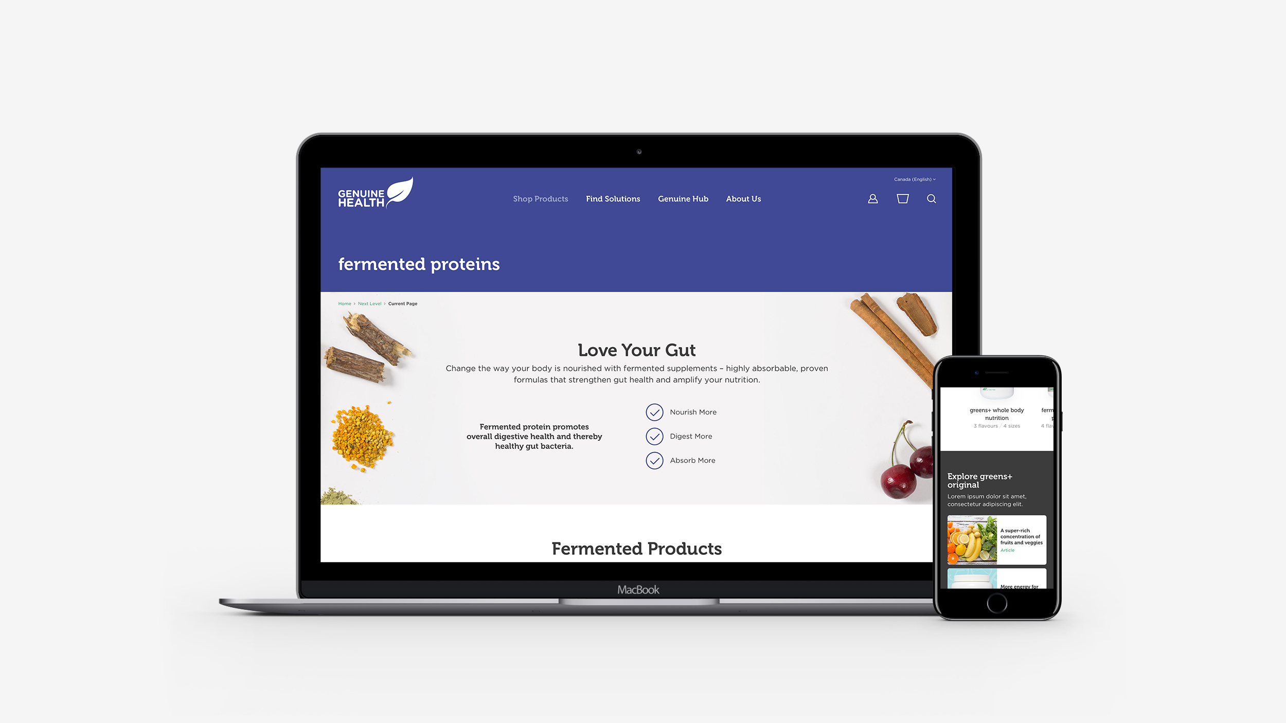
PDP Color Switcher — To create a visual distinction between product categories and really showcase the new packaging, we utilized the category colors in a bold and unique way. Each category and product page is themed with a specific color to match the packaging.
This turned out to be an interesting design challenge, as every color had to be accessible and have enough contrast on the gray and white background in every situation.


Header Navigation — Similarly to the product pages, the navigation had to work well reversed onto color. All navigation utilities and states were provided to the engineers, along with animation examples and detailed acceptance criteria outlining specific interactions and behaviours.

Style Guide — Form styles with error and success states, typography for desktop and mobile, and category header color variations.