iamota Redesign
UX & UI Design for iamota / 2018 / Live Site
Purpose — To elevate iamota's brand by developing a new and scalable design language, and to leverage WordPress for streamlined content edits.
My Role — Worked directly with our Design Director and Strategy Lead to wireframe the main pages and components. I led the brand transition and the design of all pages and components. I then worked closely with the engineers during the development and QA phase through to launch.
New Typeface — To elevate iamota's identity, I felt that we needed to introduce a new typeface. I selected Acumin Pro for its simplicity, versatility, and aesthetic. The fact that it looks like Helvetica at first but has a slightly more technical feel and uniqueness to it, embodies iamota's style: refined but unconventional at the same time.
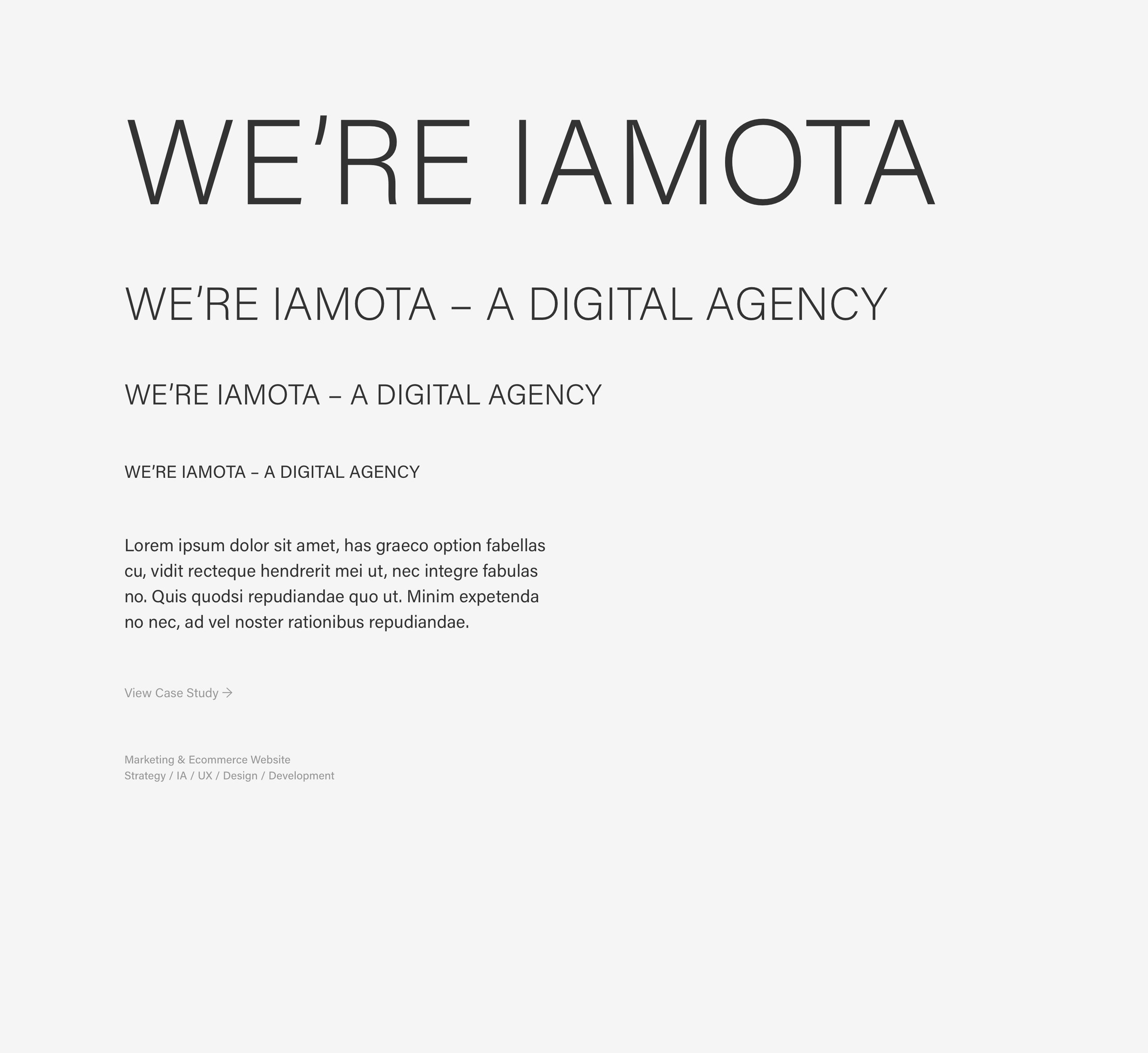
![Home [Desktop & Mobile]](https://images.squarespace-cdn.com/content/v1/5a55cc29f09ca40d2a5aed4e/1530419959305-QFAMR7PT4W3SQJ5HLF8K/Home.jpg)
Home [Desktop & Mobile]
![Work [Desktop & Mobile]](https://images.squarespace-cdn.com/content/v1/5a55cc29f09ca40d2a5aed4e/1530420027918-VTA90R81K9SEQJ1PJPCP/image-asset.jpeg)
Work [Desktop & Mobile]
![Case Study [Desktop]](https://images.squarespace-cdn.com/content/v1/5a55cc29f09ca40d2a5aed4e/1530420086774-CLSSZWPS63HVKY1YXV55/image-asset.jpeg)
Case Study [Desktop]
![About [Desktop & Mobile]](https://images.squarespace-cdn.com/content/v1/5a55cc29f09ca40d2a5aed4e/1530420116007-A293FAQI9Z0CA64R1CR9/About.jpg)
About [Desktop & Mobile]
Eric Krtinić © Selected Work 2024