Manitoba Harvest Redesign
UI Design for iamota / 2016 / Live Site
Purpose — To revamp the entire digital experience, develop a frictionless checkout system, and to position the brand as the category leader.
My Role — Worked with the Lead Designer to determine the IA, develop wireframes, and establish the overall creative vision. I led and participated in workshops with our Lead Designer, Strategy lead, and clients to design the style guide, main pages, components, and interactions. I also saw the project through to development and launch.
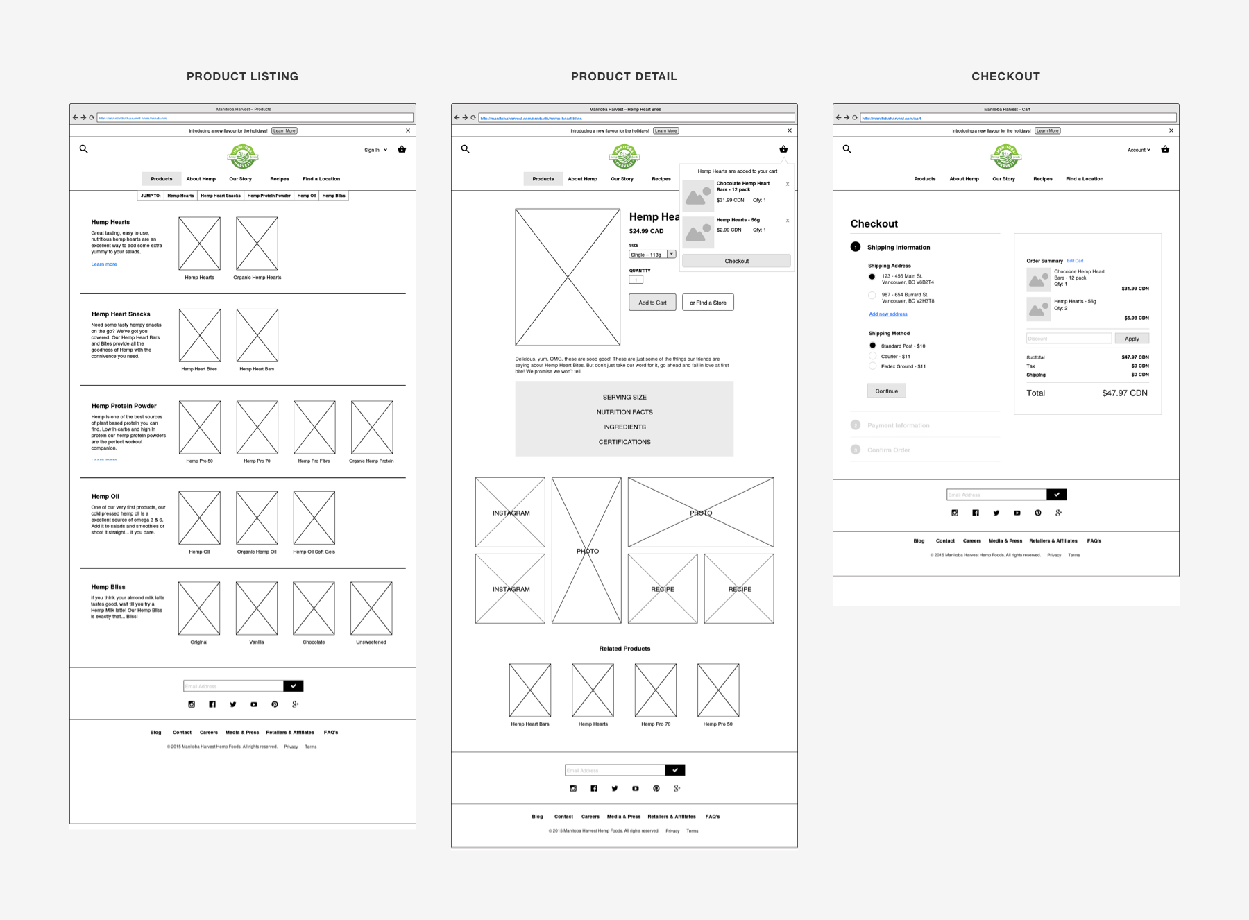
Wireframes (Purchase Flow) — As a general rule of thumb when an action is taken, the user needs feedback on the page to tell them whether the action is loading, has failed, or has succeeded. In this case, we made sure it was very clear to the user when they've added something to their cart.
To solve this problem we added a loading animation to the "Add to Cart" button, an unobtrusive notification when it succeeds, and a visual indicator to the cart icon.

Product Size Selector — On the Product Detail page, users are able to select flavor and size variants. We found that on most packaged goods' sites, all product sizes look similar. To remove this flaw, we designed a carousel using the silhouettes as thumbnails and sized all product images relative to each other creating a visual distinction between product sizes, allowing the user to view more than just the weight.
A technical challenge we faced with this had to do with updating the UI. The product images had to update the selected size and price over on the right and vice versa so that the user would add the correct size to their cart.

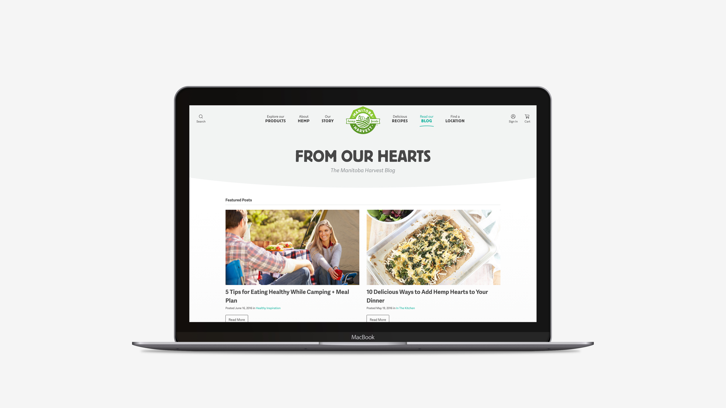
Header Navigation — To make Manitoba Harvest stand out amongst its competitors, we felt the need to do something different with the navigation. They had a nice symmetrical logo so there was an opportunity to do a centred navigation. The challenge here was handling that responsively.
To solve for that, we fine tuned the spacing and typography at each breakpoint to ensure it looked great and functioned well on all devices.


Style Guide — Since the client was tasked with entering in their own content, we created an image guideline document and PSD templates for each image component help them create assets.
This project also served as a learning experience for creating detailed style guides. Written acceptance criteria that outlined the behaviour of each component proved to be invaluable to the engineers when building in the interactions.

One Page Checkout — In an effort to reduce cognitive load and make the checkout process as efficient as possible, we applied a few different UX principles: eliminate unnecessary elements/tasks, leverage common design patterns, and minimize choices by displaying 1 step at a time, all on the same page to reduce load times.


Eric Krtinić © Selected Work 2024