MetaLab — Onboard Entertainment
UX & UI Design for MetaLab / 2018
Purpose — I was given 10 hours to complete this test project as part of the interview process for MetaLab. The assignment was to design screens for an interface for an electric, fully self-driving car.
I created a concept that is inspired by long family road trips, which are all about exploring and spending time together. With the invention of self-driving cars, drivers will no longer need to pay attention to the road, making them free to hang out with their passengers without risking an accident. That brings me to the main “problem” I’m aiming to solve:
On especially long stretches of road, how do we minimize boredom and enable a family to spend better time together on their road trip?
My Role — I worked on this assignment all on my own, starting with research and gathering information/inspiration, refining the solution to the problem by sketching and wireframing, designing high-fidelity screens, and animating the screens in Principle.
First Iteration: Music App
App Switching + Navigation
Refining the Solution — Sketches
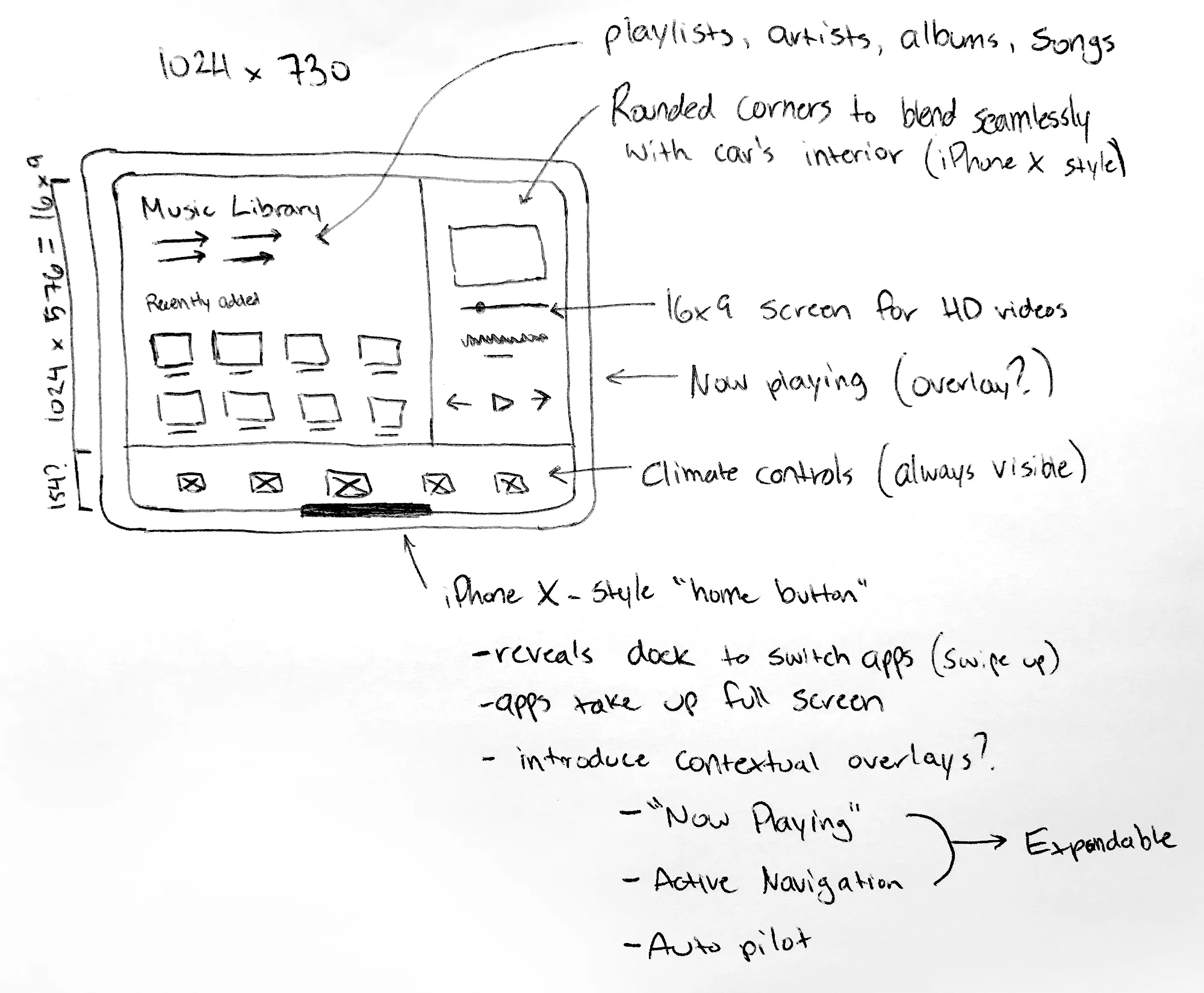
I started this process by sketching it all out. I needed to understand how the general navigation was going to work and what needed to be included in order to design even 1 screen. Some design challenges I faced early on in the sketching phase were:
How do I display the necessary car info while viewing a video/browsing?
I solved this by deciding to keep driving information in a separate dashboard away from the passengers. Rather than following Tesla’s lead by moving all information and controls to a single screen, I believe that we can simplify the screen’s functionality and make it easier to use for passengers. Only the driver needs to see the battery level, speed, mileage, etc. Also, the driving controls would be at least 2 taps away - not ideal in case of an emergency.How do I make the browsing experience as easy as possible?
Using a stationary touchscreen in a moving car can be challenging at times. To alleviate this problem, I made sure all interactive elements were large enough and the interactions were simple. Currently in a Tesla Model 3, you have to repeatedly tap on these tiny arrows to change the volume. In my sketches, I explored an interaction where you simply tap on the volume icon, then slide your finger up or down to change volume.How do I make it easy to switch apps?
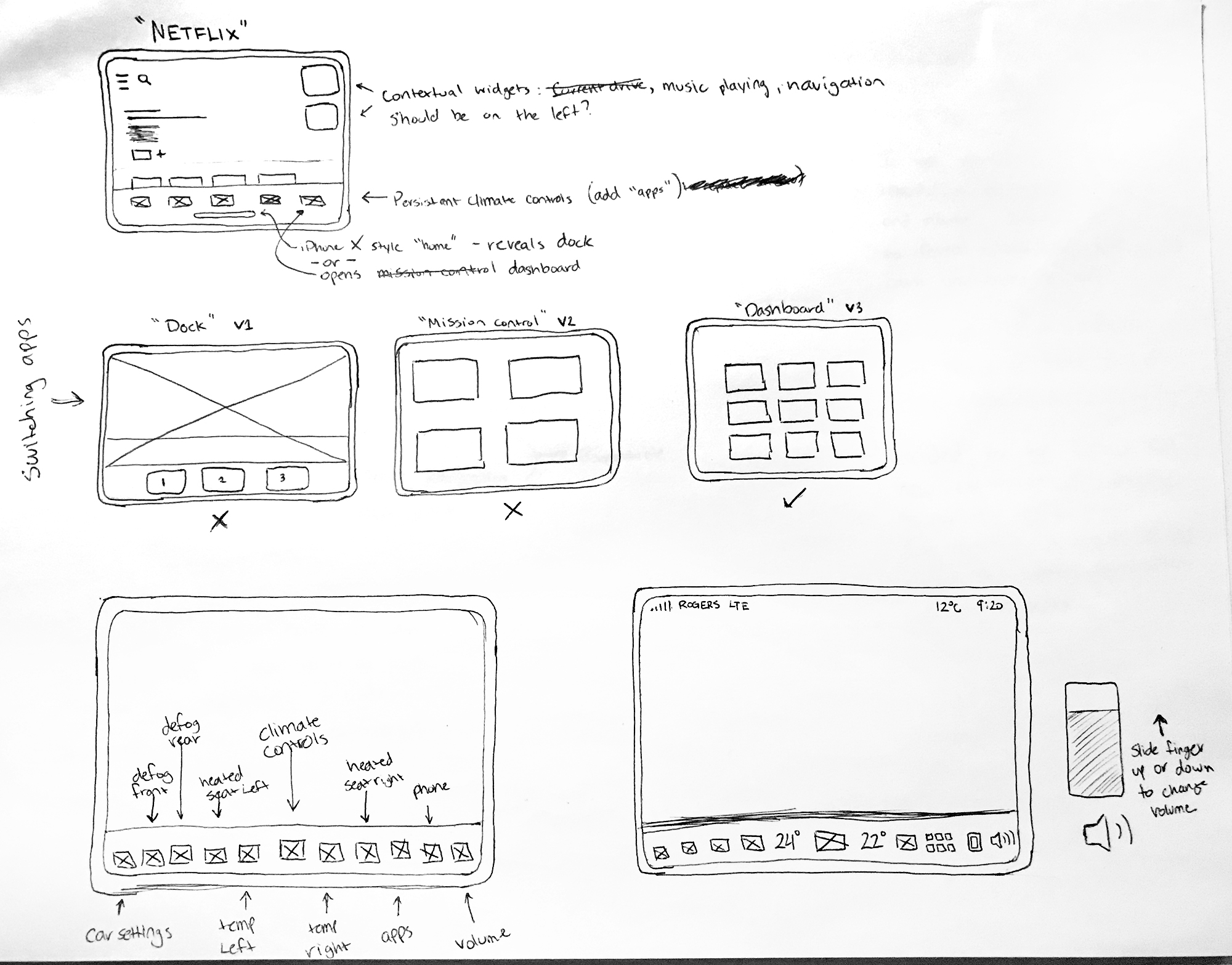
Switching apps will be an important action users in self-driving cars will need to take. I landed on a “dashboard” concept where the user is presented a grid of apps upon tapping on the icon. I initially sketched out “Dock” and “Mission Control” ideas, but they both turned out to be too complicated of an interaction and could potentially feel too busy. I aimed to present only the minimum amount of information to the user (just the app icon). In hind sight, adding a label underneath each app icon would’ve been better to prevent any guessing.Does anything need to remain visible at all times?
Ideally, the climate controls, heated seats, navigation, and volume controls were always accessible as those are frequently used. I also explored adding contextual overlays to house active navigation information and playing music. Additionally, the status bar at the top houses bluetooth phone information, the outside temperature, and the current time.
Initially, I wanted to design a music app. However, I felt that it wasn’t special enough. Autonomous cars will allow us to do much more, so I felt the need to experiment. This concept is more geared towards the riding experience rather than the driving experience.

The Base Layer

Entertainment App V1

The “Dashboard” (App Switcher)

Entertainment App V2
Refining the Solution — Wireframes
The few key decisions at this stage were:
Screen Size — Given that the specs are 1024x730, I subtracted 154px from the height to make the content area a perfect 16:9 ratio for HD videos. The status bar at the top is 30px tall and the navigation bar at the bottom is 124px tall.
Horizontal Scroll — To maximize screen real estate, sections are grouped into horizontal lists. This allows for an easier browsing experience when you’re able to swipe both vertically and horizontally.
Persistent Navigation — The always-visible navigation bar at the bottom has icons that are arranged based on reachability. The car settings and defoggers are placed next to the driver, while the apps, phone, and volume controls are placed next to the passenger (assuming this is the North American model. This can easily be swapped for right-hand drive). The other icons are placed symmetrically in the middle.
Horizontal Arrows Removed — Since the last tile in a row is peaking around the corner, I felt the arrows were redundant and unnecessary. Swiping will do!
No Titles/Descriptions — Inspired by Netflix and iTunes, I wanted this to be a cleaner, more visually driven experience. The movie and TV posters themselves would have the title in them, so I didn’t feel the need to repeat it.

The entertainment app’s home screen. Here you can browse TV shows and movies. Given more time, I would add a few more rows with varying tile designs.
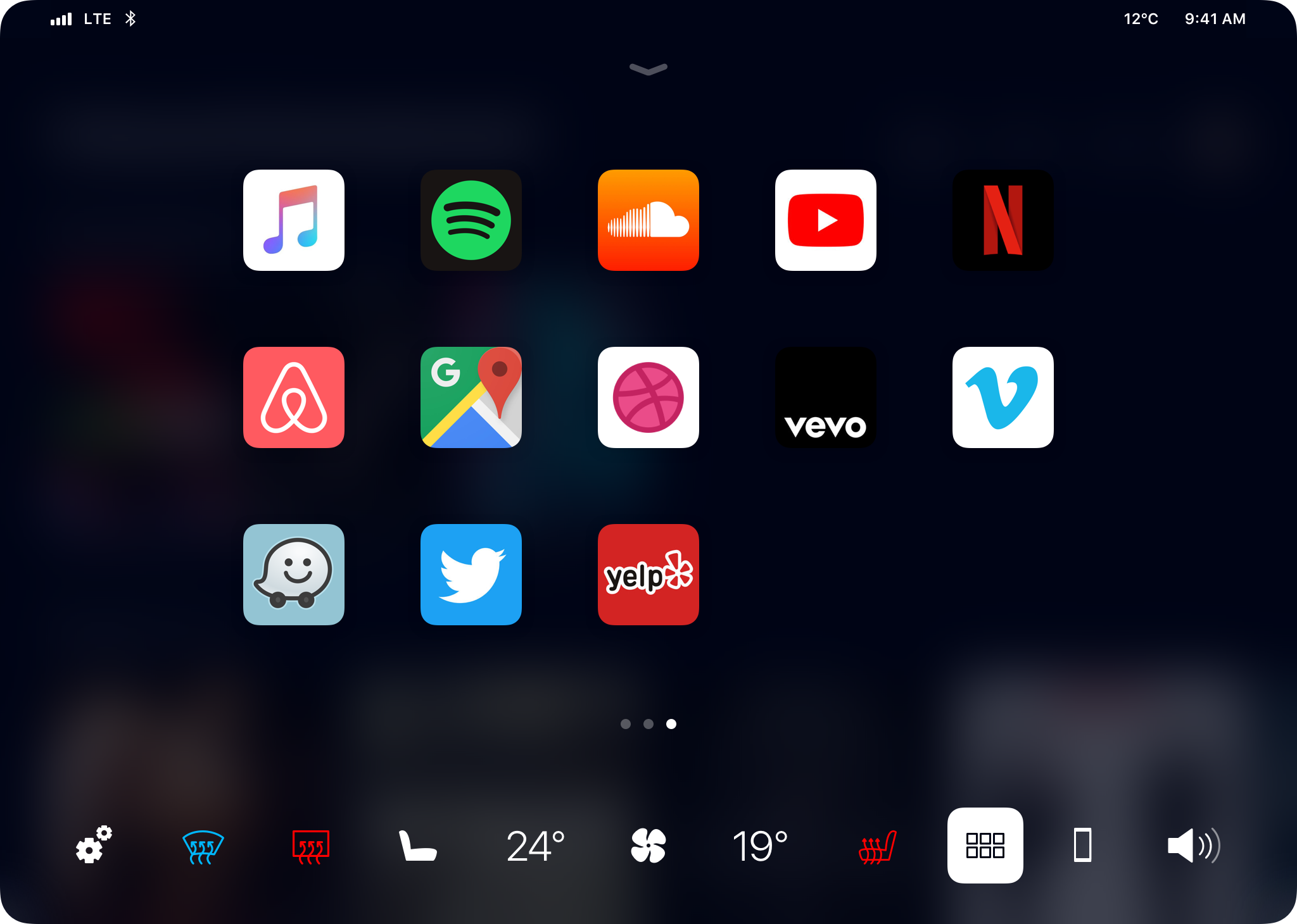
The car’s app switcher.
Visual Design
Dark Theme — I chose a dark, night theme to give it that romantic, cinema feel that you might find in a movie theatre or at home. Instead of opting for plain black, I went with a beautiful midnight blue to let black tiles stand out a bit and to feel a little mysterious.
San Francisco Font — A beautiful sans-serif font to make the design feel friendly and familiar, yet sophisticated.
Rounded Corners — To integrate more seamlessly with the car’s interior.
App Dashboard Carousel — Rather than having a scrolling page, I went with a carousel so that it wouldn’t require the user to be particularly precise (again, moving car situation) and it allowed me to develop a slick animation where the Dock background expands upwards, giving it nice blurred background.

In-Situ Mockup — The screen is placed in the centre of the car, facing straight on, so everyone in the car can see it.
Eric Krtinić © Selected Work 2024